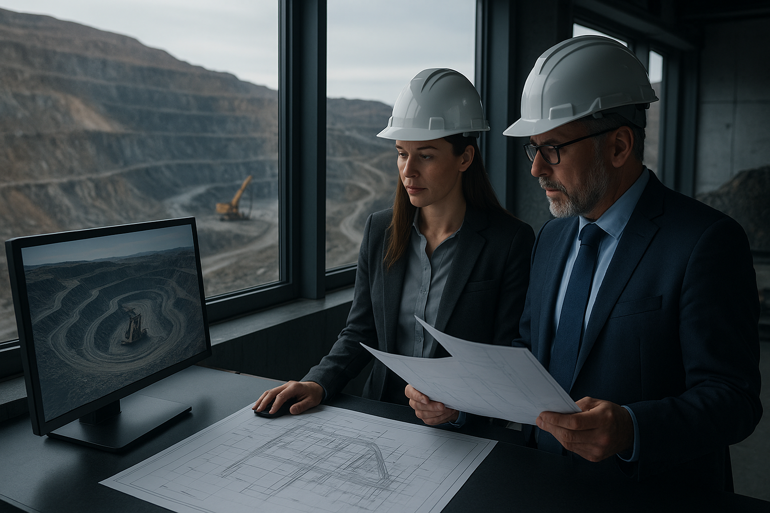
About Mincore
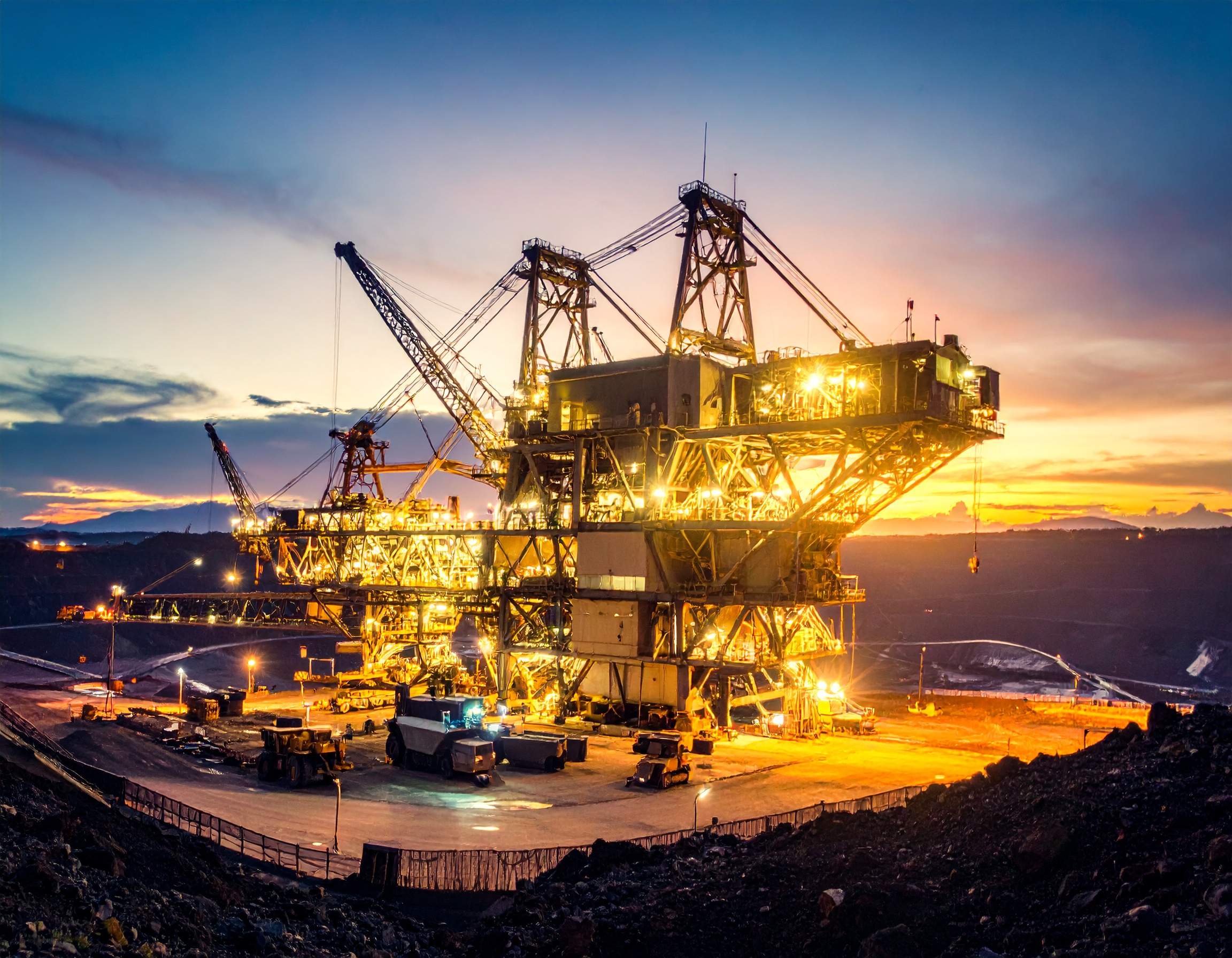
Mincore is a leading Australian company specializing in Engineering, Contracting, and Equipment Supply for Mining, Metals, Minerals Processing, Building Materials, Heavy Industries, and Renewable Energy. With a strong global presence, we have capabilities and representatives across Australia, Vietnam, Southeast Asia, Africa, Americas, Europe, Papua New Guinea and the Pacific Islands, ensuring seamless project execution worldwide.
Learn More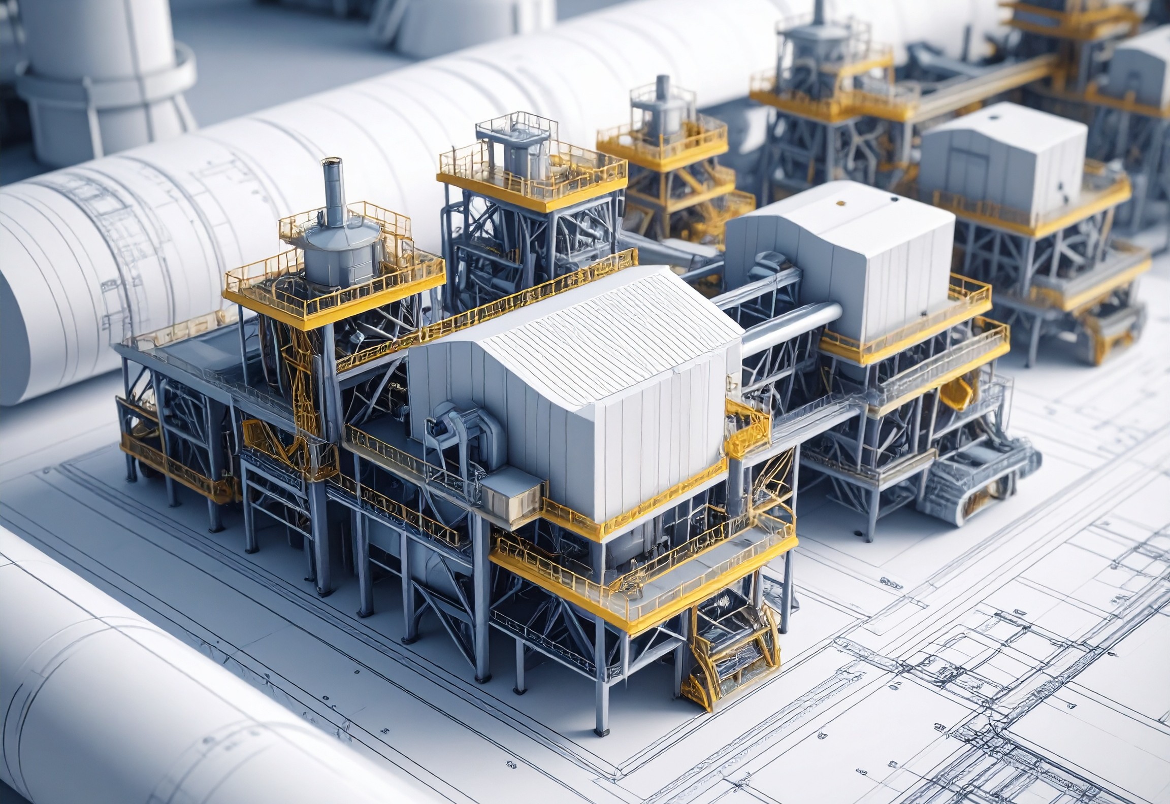
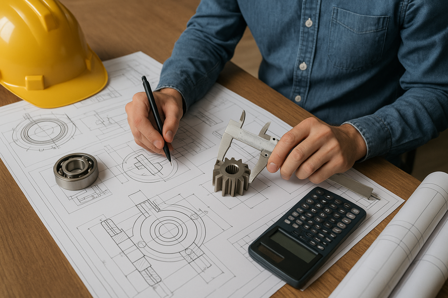
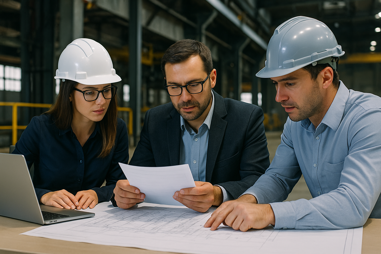
SERVICES
.jpg)
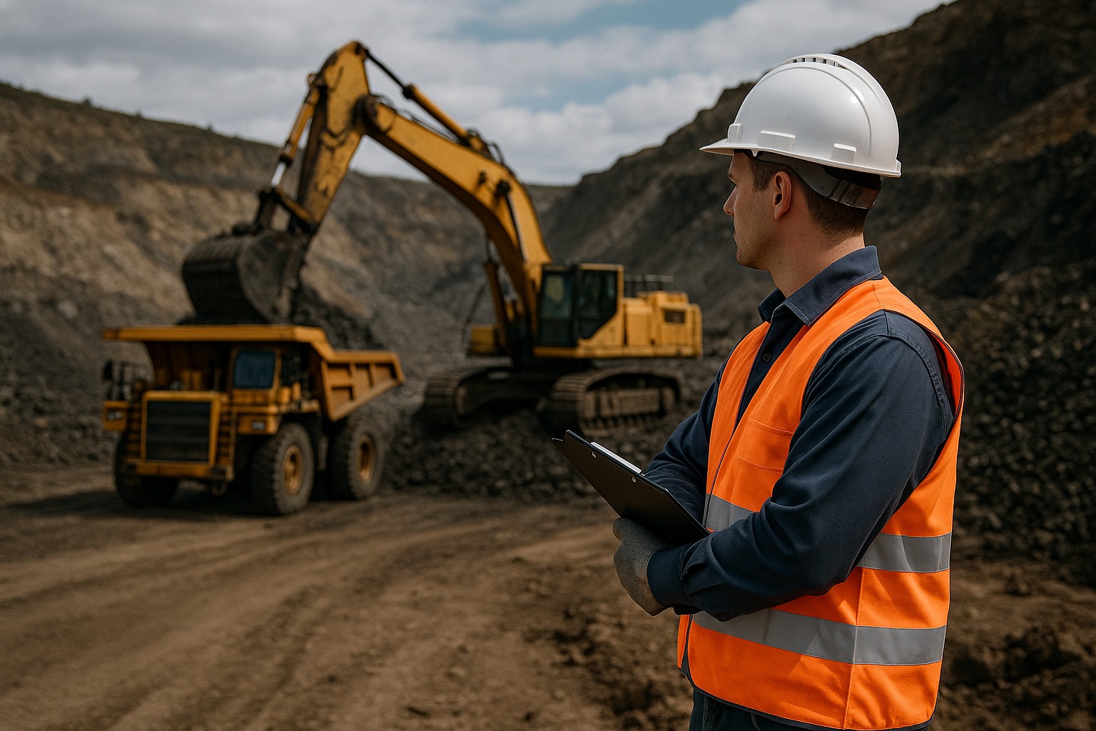
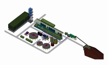
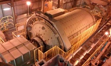
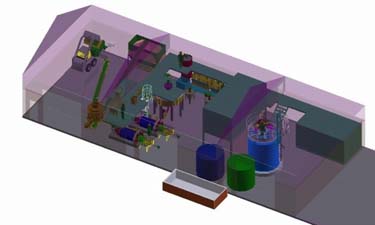
PROJECTS
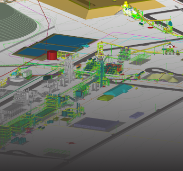
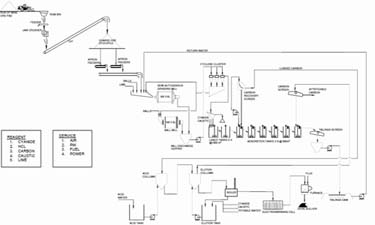
Pacific Lime and Cement Limited – Central Lime Project
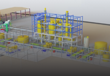
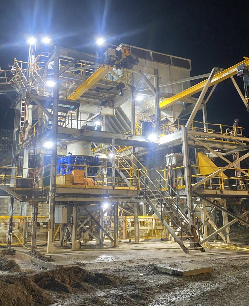
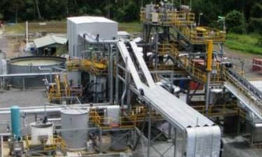
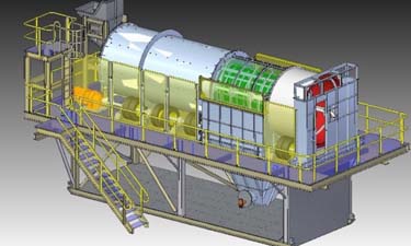
Latrobe Magnesium - EPCM 1000 tpa Demonstration Plant
Ionic Rare Earth (IRE) – Rare Earth
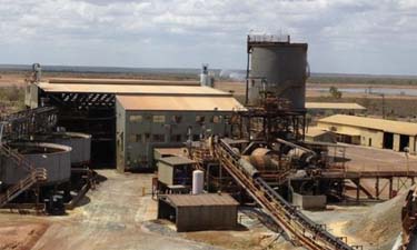
Kingston Resources – Misima Gold Project
Fosterville Gold Mine FGM – Samplers Upgrade
Red River Resource - Gravity Circuit Design for Hillgrove Gold Mine
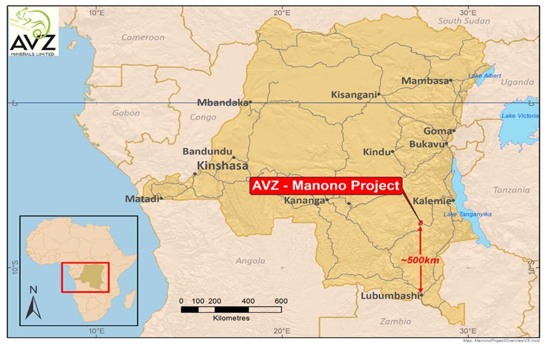
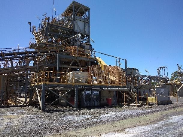
AVZ Minerals Limited – DRC– Manono Lithium and Tin Project
BCM International – Poura Gold Mine Feasibility Study
Fosterville Gold Mine FGM – Gold Room Upgrade

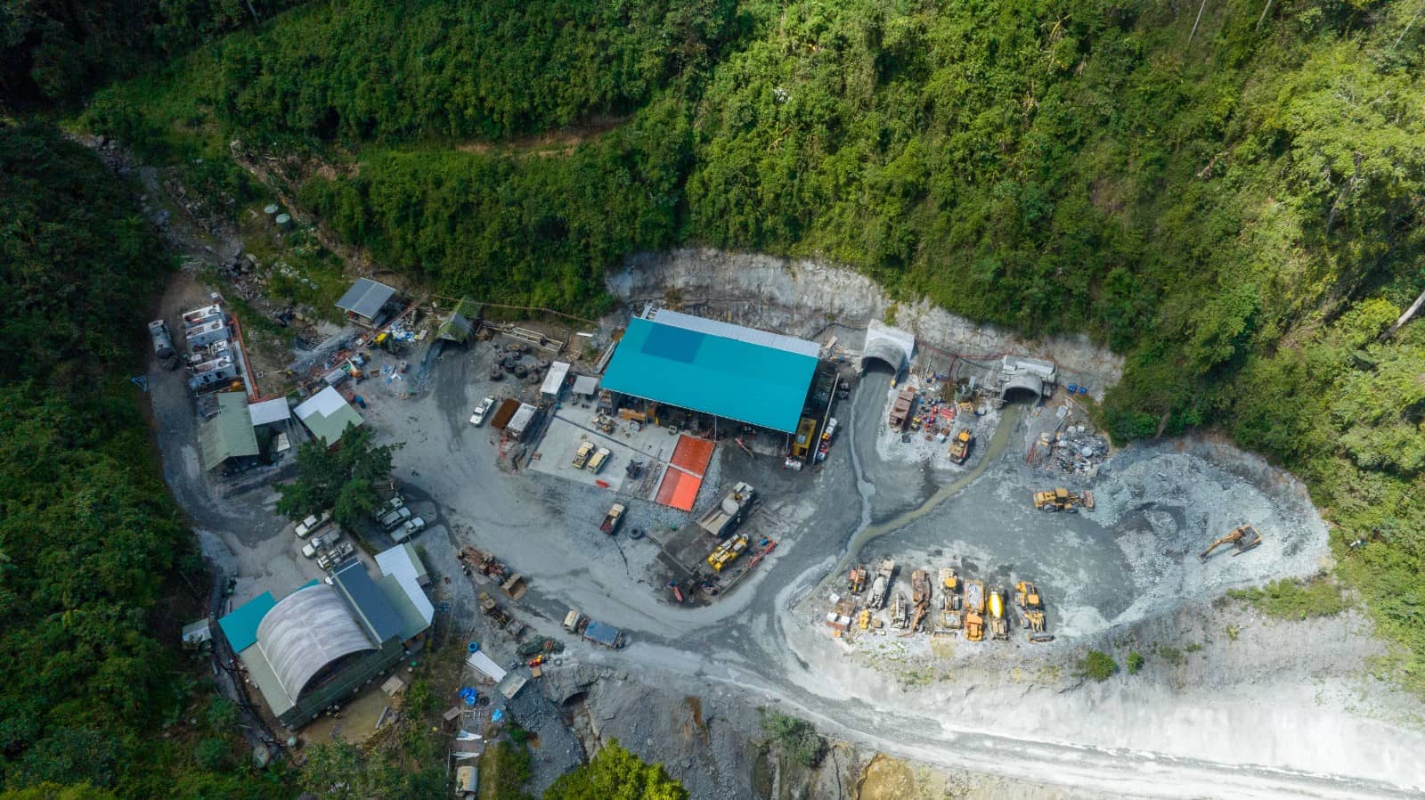
Lane Xang Minerals Limited Copper Mine LXML
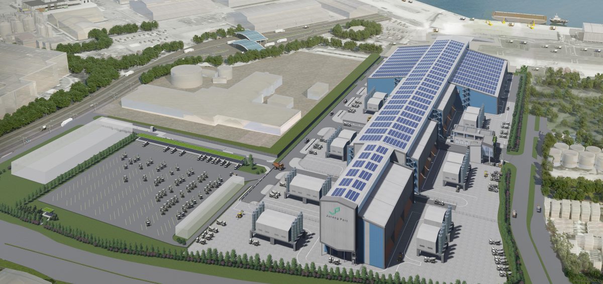
Arup- Jurong Port RMC Project Singapore
Mineral Hill – Gold Mine Restart
K92 Mining – Kainantu Gold – 1MTPA Expansion Project
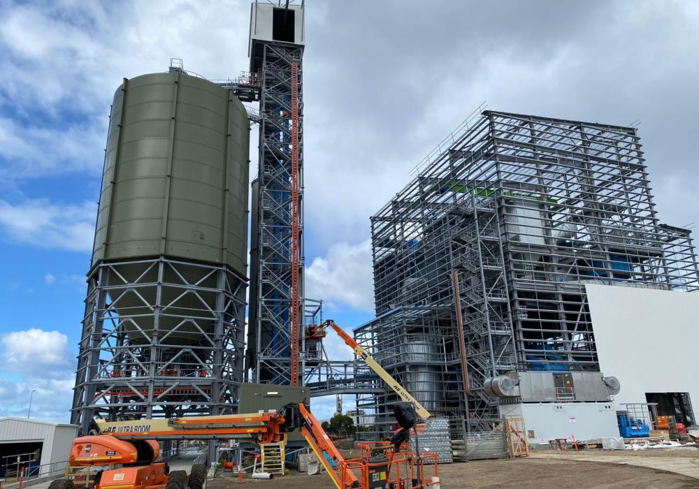
Christian Pfeiffer – Conveyor Design & Supply Package for Boral Cement Facility, Geelong
Investigator Resources – Paris Silver Project
Lane Xang Minerals Limited Copper Mine LXML – Sepon Primary Gold Restart
Arete Capital – Stawell Gold Mines (Gold) Plant Refurbishment and Restart
Bassari Makabingui - Gold Project
K92 Kainantu - Gravity Gold Project
K92 Kainantu - 400ktpa Expansion Project
Aura Energy – Tiris Uranium Project
RioTinto Alcan – Gove (Bauxite)
Evolution Mining (Gold)
RioTinto Alcan – Weipa (Bauxite)
Goodline – RioTinto Alcan – Gove (Bauxite)
Hanson Quarries – Screenhouse Upgrade (Concrete Products)
Newcrest – Argillic Ore Scrubber
RioTinto Alcan Weipa – Transfer Chute Upgrades
RioTinto Alcan – South of Embley Project
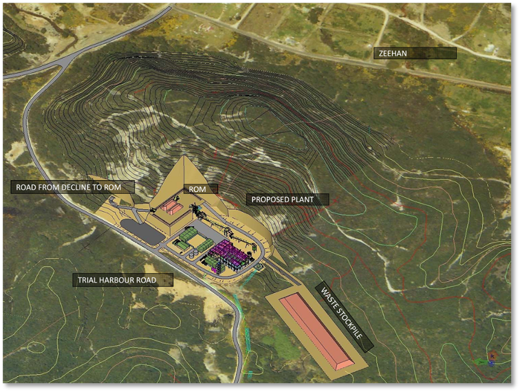
Stellar Resources – Heemskirk Tin Project
Red River Resources – Restart Study
Elementos - Tin Tails Retreat Project
Unity Mining – Dargues Gold Mine VER
BMER GIT - Training Facility
Guinea - 1.5Mtpa CIL Plant

OUR PARTNERS

.png)